Data Visualisation Flashcards
Why need data visualisations
- Humans easily recognise patterns
- faster understanding than a mass of numbers or text
information is meaningless without context - expand
Without context information nor charts cannot be evaluated.
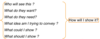
It’s important to answer these questions:
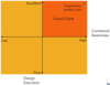
The Good Chart Matrix
Contextual Awareness: What am I trying to Say, To Whom and where?
Design Execution: How well is this chart constructed?
- Requires principles that help you understand why you’d choose a bar chart or a line chart or no chart at all.
- A perfectly relevant visualization that breaks a few presentation rules is far more valuable than a perfectly executed, beautiful chart that contains the wrong data, communicates the wrong message, or fails to engage its audience.
- The more relevant a data visualization is, the more forgiving, to a point, we can be about its execution.
Three interrelated trends are driving the need to learn and practice visual thinking.
1. Increasing volume of visualizations.
- Raised expectations due to constant exposure to better dataviz.
2. Increasing data volume and velocity.
- So much information hitting us so fast that it demands a abstract and simplified way of communication - dataviz.
3. Increasing participation.
- Everybody’s doing it because it has become cheap and easy.
Conventions and Metaphors
We rely on conventions and metaphors.
We are hardwired and shaped by upbringing to see and expect the world like this.
5 things we do when a chart hits our eyes
1. We don’t go in order.
- Visuals aren’t read in a predictable, linear way, as text is.
- Instead, we look first at the visual and then scan the chart for contextual clues about what is important.
-
What this means:
- “write” charts spatially, from the visual outward
2. We see first what stands out.
- Our eyes go directly to change and difference, such as unique colors, steep curves, clusters, or outliers.
-
What this means:
- Whatever stands out should match or support the idea being conveyed. If it doesn’t, it will distract from and fight for attention with the main idea.
3. We see only a few things at once.
- A visual that contains tens, hundreds, or thousands of plotted data points shows us a forest instead of individual trees. The more data that’s plotted in a chart, the more singular the idea it conveys.
-
What this means:
- To focus on individual data points, plot as few as possible
4. We seek meaning and make connections.
-
What this means:
- If visual elements are presented together, they should be related in a meaningful way; otherwise viewer creates false relationships.
5. We rely on conventions and metaphors.
- We use learned shortcuts to assign meaning to visual cues on the basis of common expectations (green is good, red is bad).
-
What this means:
- Embrace conventions and metaphors when creating visuals, otherwise creates confusion.
2 questions about the nature and purpose of your visualization
1. Is the information conceptual or data-driven?
- Either you’re visualizing concepts and qualitative information or you’re plotting data and information.
- But notice that the question is about the information itself, not the forms that might ultimately be used to show it.
2. Am I declaring something or exploring something?
-
Declarative: well-designed, finished products;
- e.g. presenting sales data
- Confirmatory: looking to understand something, less formal
- Exploratory: unsure what you are looking for, rough design; good for brainstorming and discoveries

Concepts & Models
Concepts arise as abstractions or generalisations from experience; from the result of a transformation of existing ideas; or from innateproperties.
All models are wrong, some are useful.
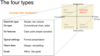
4 types of visualisations (matrix)
Helps make more appropriate decisions about the needed forms, time and skills.
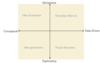
Idea illustration quadrant in detail
At their best, declarative, conceptual visualizations simplify complex ideas by drawing on people’s ability to understand metaphors (trees, bridges) and simple conventions (circles, hierarchies).
Examples:
- organisational charts
- decision trees
- cycle diagrams

Idea generation quadrant in detail
Explore ideas using non-data visuals
- whiteboard
- back of a napkin
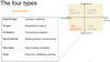
Visual discovery quadrant in detail
Actually two categories - 3 possible types of tasks: declarative, confirmatory, and exploratory.
Confirmatory applies only to data-driven charts.
- A hypothesis can’t be confirmed or disproved without data.
- Soft distinction. Confirmation is a kind of focused exploration, whereas true exploration is more open-ended. The bigger and more complex the data, and the less you know going in, the more exploratory the work.
Visual confirmation. Answer two questions:
- Is what I suspect is true actually true?
- What are some other ways of looking at this idea?
- The scope of the data here is manageable, and the chart types you’re likely to use are common (not necessarily).
- Confirmation usually doesn’t happen in a formal setting; it’s the work you do to and the charts you want to create for presentations. That means your time will shift away from design and toward prototyping that allows you to iterate on the data and rapidly visualize and re-visualize.
Visual exploration.
- usually data scientists and business intelligence analysts
Everyday dataviz quadrant in detail
The data sets tend to be small and simple.
Goal: give people factual information based on data
What are BI applications
Deliverables by the BI team
- For business people to use in their analysis
- Usually, build several BI applications at a time
Deliverables can be
- Report
- Dashboard
- Scorecard
- Data visualization
- Ad hoc query
- OLAP cube
- Predictive model
- Data model
Role of Requirements in BI Applications + 2 types of requirements
- Foundation for a successful BI solution
- Development team uses these requirements to:
- design
- develop
- deploy BI systems
- Functional requirements: what the users will get; use cases
- Non-functional requirements: define qualities and constraints
- qualities define the properties and characteristics which the delivered system should demonstrate
- constraints are the limitations, standards and environmental factors which must be taken into account in the solution
- e.g. availability, performance, security, operability
Draw stepwise refinement of requirements
Stepwise refinement is the process of taking business requirements and going deeper into the details to define data, functional, technical, and regulatory requirements.
Stepwise refinement is also called functional decomposition.

Defining requirements workflow
Data Profiling - structure and content of input data
Visualize Functions - use storyboards, mockups, use cases, wireframes, prototypes
Replacement Requirements - Data Shadow Systems - stuff the business unit has already built for its own reporting and analysis (Excel, etc.) The project’s aim is to get that into a properly developed and maintained BI solution, to protect against a number of potential problems, e.g. loss of the person who built the system, obsolescence of the technology used to build it, difficulty in keeping up with changes in underlying data

Next step after requirements have been gathered
- Now need to develop BI content specifications
- Starting point for design, development of BI applications
- BI lends itself to an iterative and incremental methodology
- Mix of waterfall and agile
Comparison analysis – bar chart
- Bar charts are very effective because the lengths of the bars represent quantitiesthat can be compared quite easily
- Often best to use one colourbecause it is easier to estimate the different sizes
- Horizontal bars work well for any number of items
- Vertical bars work well with fewer than twelve items
Bar charts are one of the most common ways to visualize data. Why? It’s quickto compare information, revealing highs and lows at a glance. Bar charts areespecially effective when you have numerical data that splits nicely into differentcategories so you can quickly see trends within your data.
When to use bar charts:
- •Comparing data across categories. Examples: Volume of shirts in differentsizes, website traffic by origination site, percent of spending by department.
Also consider:
- •Include multiple bar charts on a dashboard. Helps the viewer quicklycompare related information instead of flipping through a bunch of spreadsheets or slides to answer a question.
- •Add colourto bars for more impact. Showing revenue performance withbars is informative, but overlaying color to reveal profitability providesimmediate insight.
- •Use stacked bars or side-by-side bars. Displaying related data on top ofor next to each other gives depth to your analysis and addresses multiplequestions at once.
- •Combine bar charts with maps. Set the map to act as a “filter” so when youclick on different regions the corresponding bar chart is displayed.
- •Put bars on both sides of an axis. Plotting both positive and negative datapoints along a continuous axis is an effective way to spot trends.

Trend analysis - line graph
- Line charts very effective at displaying segmented data which changesover time
- Better than bar charts if the user wants to examine the trends and their totals
- Here we have the value of bike sales by type over time
Line charts are right up there with bars and pies as one of the most frequently usedchart types. Line charts connect individual numeric data points. The result is a simple,straightforward way to visualize a sequence of values. Their primary use is to displaytrends over a period of time.
When to use line charts:
- •Viewing trends in data over time. Examples: stock price change over a five yearperiod, website page views during a month, revenue growth by quarter.
Also consider:
- •Combine a line graph with bar charts. A bar chart indicating the volume soldper day of a given stock combined with the line graph of the corresponding stockprice can provide visual queues for further investigation.
- •Shade the area under lines. When you have two or more line charts, fill thespace under the respective lines to create an area chart –see next slide. This informs a viewerabout the relative contribution that line contributes to the whole.

Trend analysis – area chart
Area chartsare good at showing the individual contributions and the totals over time
Here we have the value of bike sales by type over time but we can also see the total value of bike sales
When you have two or more line charts, fill thespace under the respective lines to create an area chart. This informs a viewerabout the relative contribution that line contributes to the whole.

Trend analysis – bar chart

Contribution analysis – heat map
The contribution that something makes is usually represented by a percentage. People usually use a pie chart.
When there are too many slices in a pie chart (more than four or five) it gets hard to compare the slices
A heat map can accommodate a much larger number of slices, especially when you use a colourgradient to make it more useful
Notice we’ve selected Australia in the filter on the right!
Heat maps are a great way to compare data across two categories using color. Theeffectis to quickly see where the intersection of the categories is strongest and weakest.
When to use heat maps:
- •Showing the relationship between two factors. Examples: segmentationanalysis of target market, product adoption across regions, sales leads by individual rep.
Also consider:
- •Vary the size of squares. By adding a size variation for your squares, heatmaps let you know the concentration of two intersecting factors, but add a thirdelement. For example, a heat map could reveal a survey respondent’s sportsactivity preference and the frequency with which they attend the event based oncolour, and the size of the square could reflect the number of respondents in thatcategory.
- •Using something other than squares. There are times when other types ofmarks help convey your data in a more impactful way

Correlation analysis – scatter plot
Scatter plotswork well for correlation analysis, especially when size and colourare used to show variation in the measure’s quantitative values
Using scatter plots is a quick, effective way to spot outliers that might warrant furtherinvestigation.
By creating this scatter plot, an insurance investigator canquickly evaluate where they might have fraudulent activity.
When to use scatter plots:
- •Investigating the relationship between different variables. Examples: Maleversus female likelihood of having lung cancer at different ages, technology earlyadopters’ and laggards’ purchase patterns of smart phones, shipping costs of different product categories to different regions.
Also consider:
- •Add a trend line/line of best fit. By adding a trend line the correlation amongyour data becomes more clearly defined. Incorporate filters. By adding filters to your scatter plots, you can drill down intodifferent views and details quickly to identify patterns in your data.
- •Use informative mark types. The story behind some data can be enhanced witha relevant shape

Geography mapping
To visualize data by location you can use a map
You can see where your sales are –a lot in London, fair bit in Berlin and Glasgow
You can also see how a pie chart with lots of slices doesn’t really work well –they would have been better to limit the number of wedges to twoor three
In any case, when making pie charts usethemto show relative proportions – or percentages – ofinformation. That’s it. Despite this narrow recommendation for when to use pies, they
are made with abandon. As a result, they are the most commonly mis-used chart type.If you are trying to compare data, leave it to bars or stacked bars. Don’t ask yourviewer to translate pie wedges into relevant data or compare one pie to another. Keypoints from your data will be missed and the viewer has to work too hard.
When to use pie charts:
- •Showing proportions. Examples: percentage of budget spent on differentdepartments, response categories from a survey, breakdown of how Americansspend their leisure time.
- •Limit pie wedges to six. If you have more than six proportions to communicate,consider a bar chart. It becomes too hard to meaningfully interpret the pie pieceswhen the number of wedges gets too high
Pairing the map with an additional chart, such as a line chart showingtrends or a data table providing the underlying detail, is often very useful in enhancing the information conveyed
You could put all three –map, line chart, data table together on a dashboard

4 BI visual design methods
- Increasing visual detail as we go left to right
- Should be fast –clarify the design

BI storyboard
lays out the major actions that happen as the user uses the application

BI prototyping - 7 steps
This is where you build a mockup or, better, an early version of the application.
You show it to users (all personas), get feedback, and iterate

BI application development lifecycle

BI application testing
Rule of thumb: testing should be 30% of a project’s effort.
- Best done agile… test as they build
User Acceptance test – does the application meet the criteria agreed with the users, and is it usable?
System and performance testing:
- Smoke test – preliminary testing, ensure critical functions work
- Stress test – heavy load (say 150% of the expected load) to see where it stops being responsive; you may do performance analysis and tuning as you hit problems in stress test
- Soak test - run the system for a long time to ensure long-term functionaly (e.g. memory leaks)
